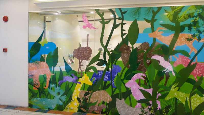
i was so upset when i saw this window today. The clients had deleted the ‘background’ of the illustration without my knowledge. The final setup looks so incomplete! i could have adjusted the illustration if i’ve known that they changed their mind and wanted a see-through window instead.

The window area that is see-through is the ‘deleted’ background.
Original image. Initially, the illustration was to be printed on two layers – front on opaque sticker and back, translucent, so as to give it more depth.
Disappointing.


1 comment:
Yea, when i read the top part of your post...i was also thinking that printing it more opaque should nail it. now looks like the right side is too "heavy". dont be upset. looks nice nonetheless! ;)
Post a Comment